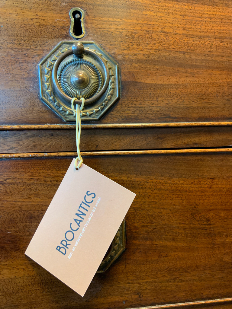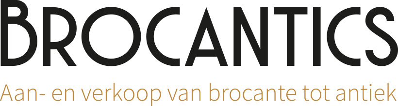
Client: Brocantics
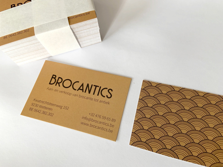
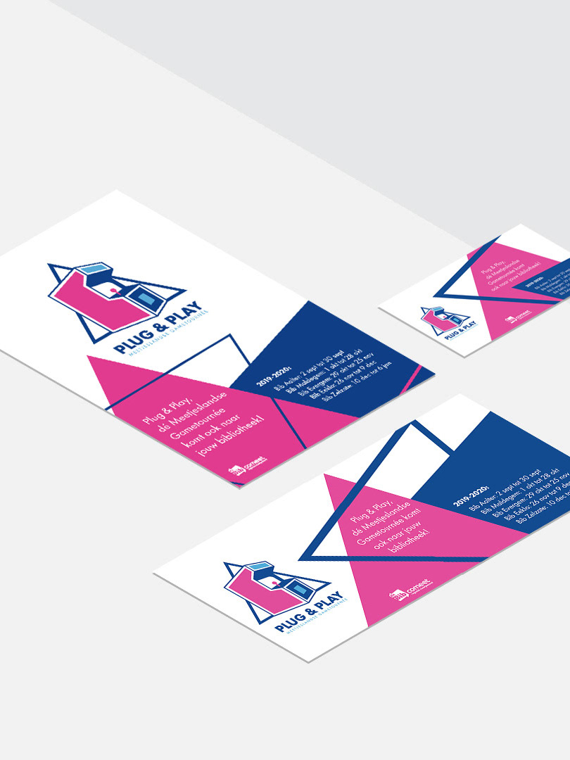
Project: Branding, offline print materials like business cards, pricing tags, SIGN materials: banners, store branding, webdesign, webshop, social media content, ...
Project: Branding, offline print materials like business cards, pricing tags, SIGN materials: banners, store branding, webdesign, webshop, social media content, ...
For Brocantics, a small antique and brocante business, exciting times had come, where after a long preparation they were finally ready to launch their business.
I first listened to their story and assessed their needs and wishes.
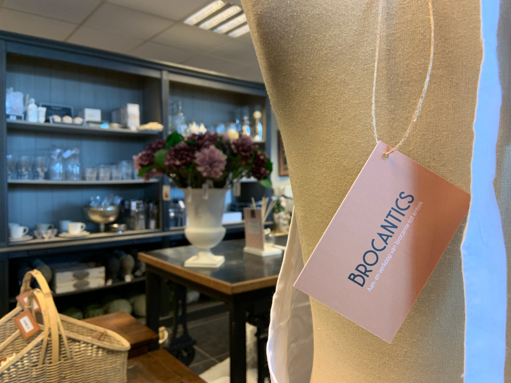
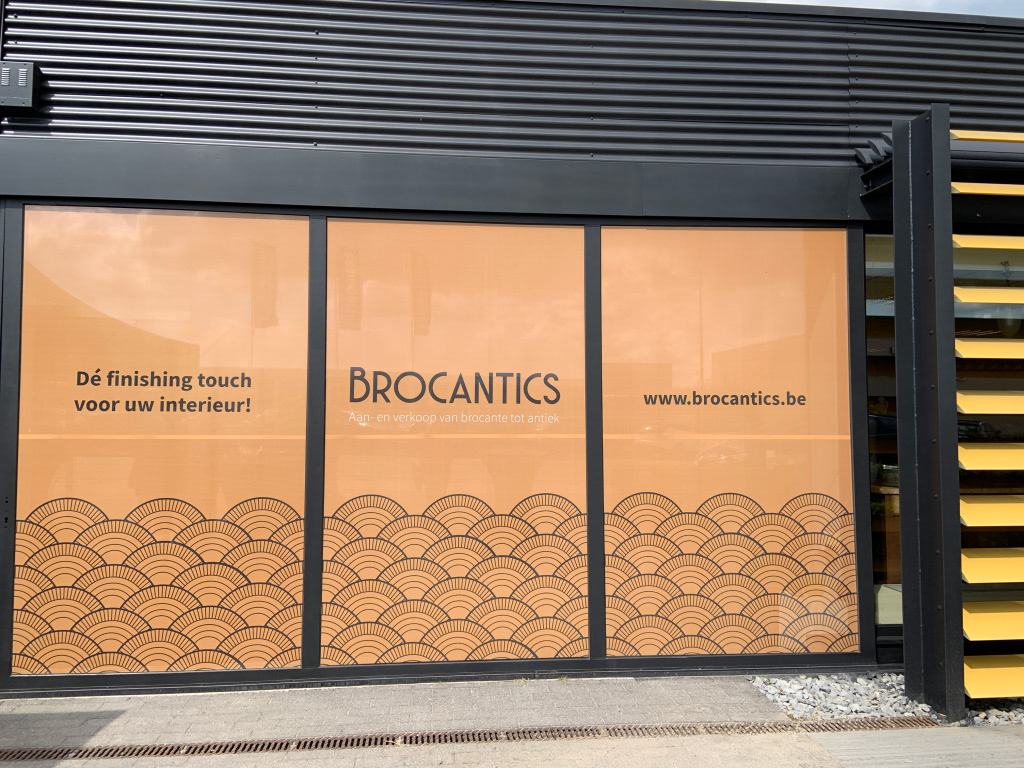
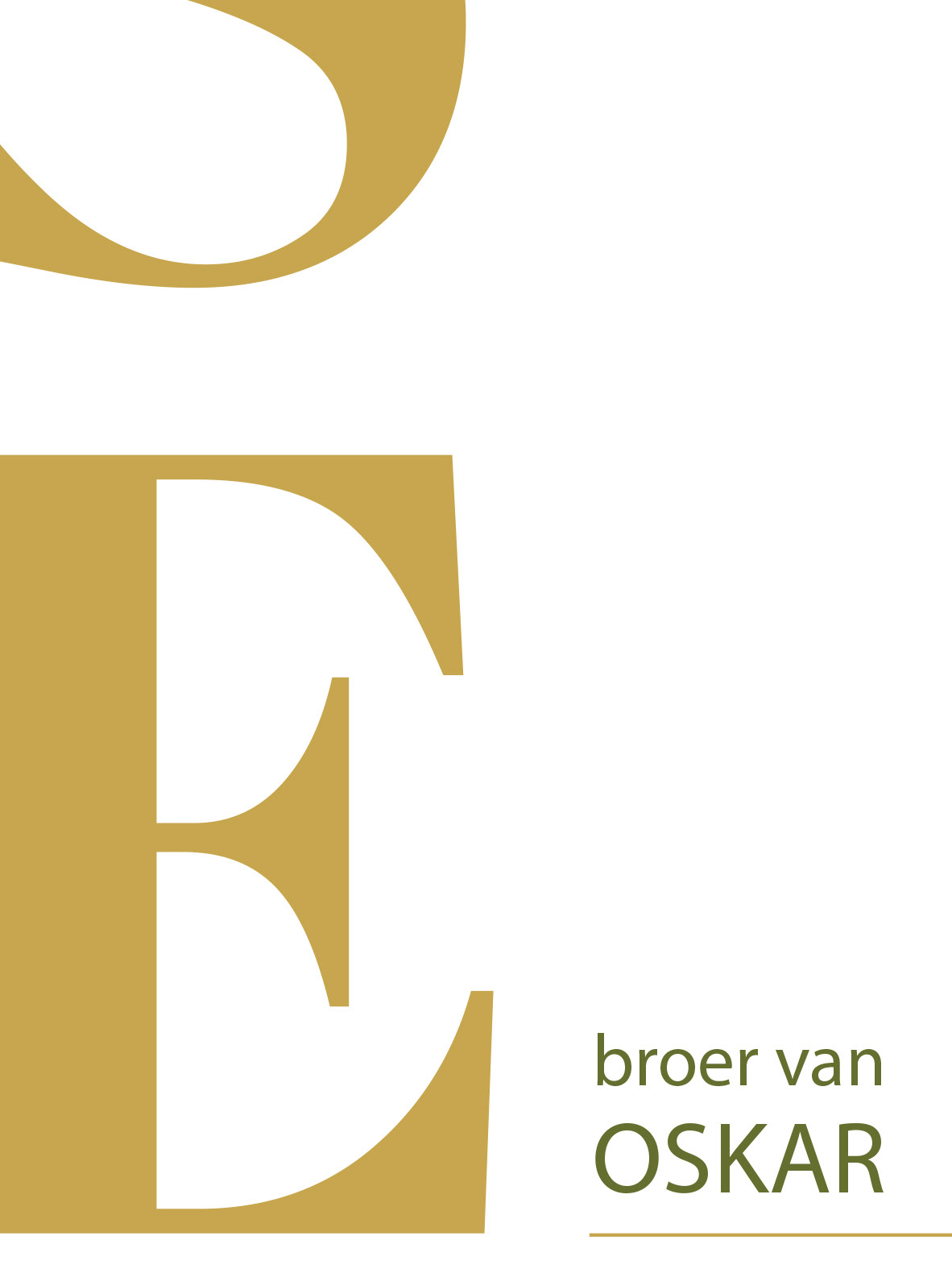
Because the focus of the business was mainly on brocante and antiques from the period of the 1920´s, I searched for inspiration in the art deco movement, both in colours and in graphical elements. Repetitive patterns, high contrasts and floral elements inspired me to create this corporate identity.
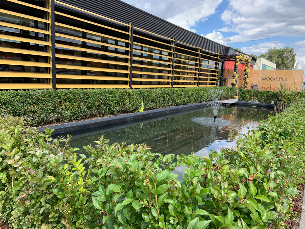
The style was applied consequently throughout the whole realisation of this new business: online on website and social media, offline on the facade of the building and banners, in business cards and invitations, price tags etc...

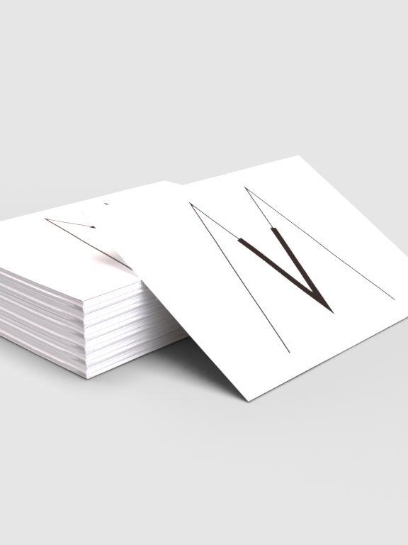
The letter icon is designed to be used as a playful extra on social media, profile pictures etc..
Because of the specific look of this font, the letter icon quickly gives a visual reference to the brand.